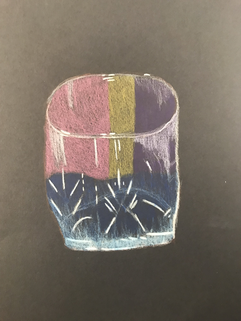
This is my first time drawing glass. It was a struggle and did not turn out the best. I could have added more white and placed the color better.
|
This is my first time drawing glass. It was a struggle and did not turn out the best. I could have added more white and placed the color better.
0 Comments
I have used Prismas before and it’s one of my favorite mediums, so I was excited to start Prisma in this class. 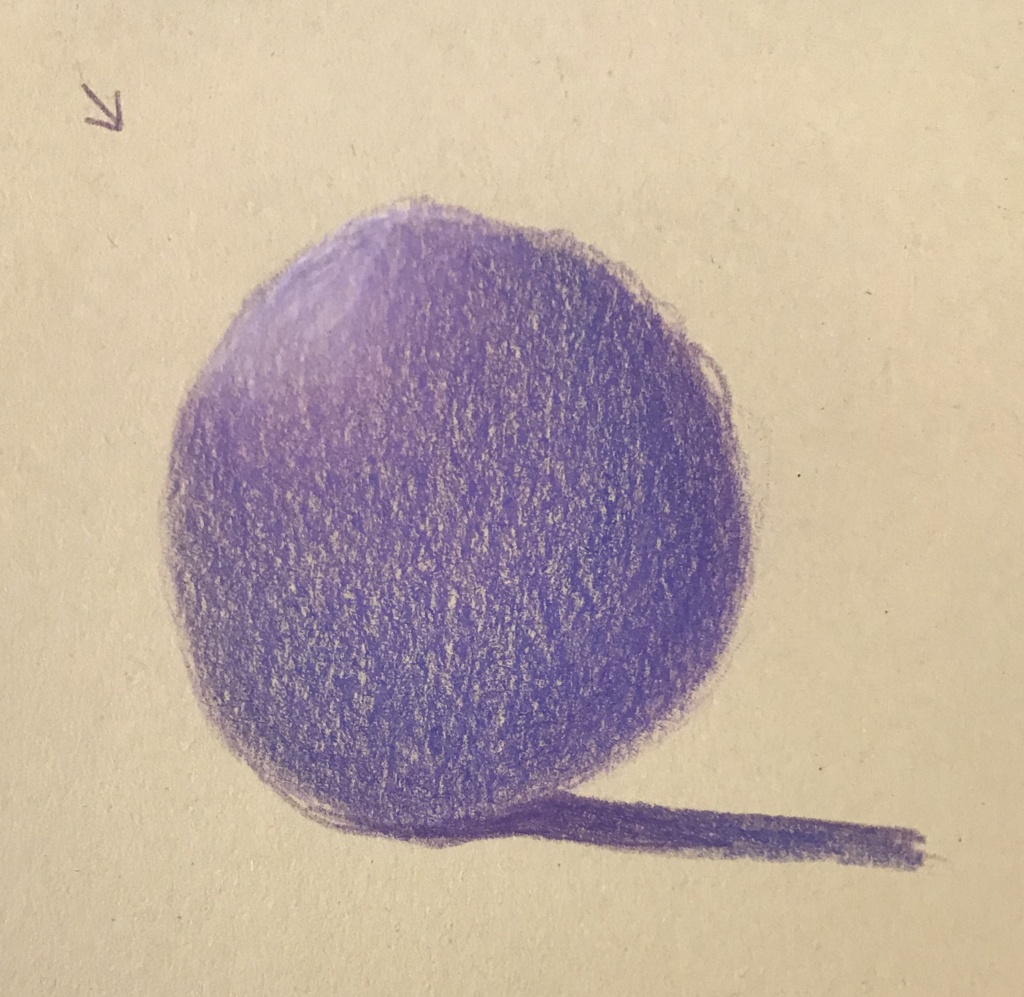 Practice with a sphere 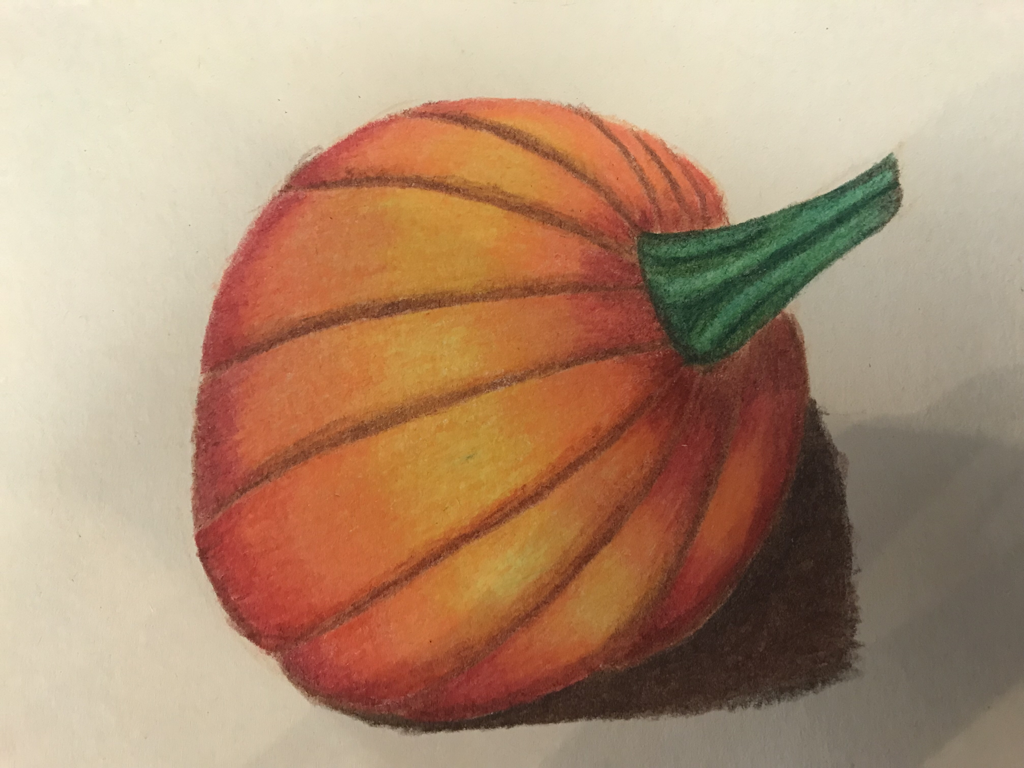 Pumpkin in Prismacolor 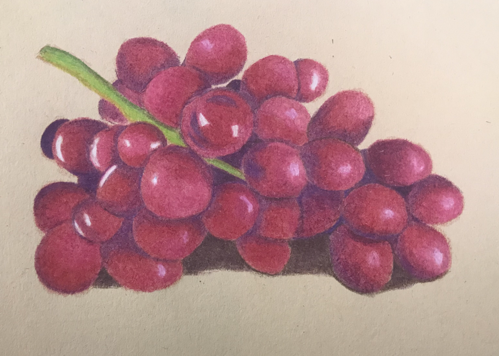 Grapes in Prismacolor The pumpkin and grapes were fun to do because they both have bright colors and lots of value changes. I’m proud with how they both turned out, but could have made the highlights in the grapes more bright.
 1. Describe the craftsmanship of your drawing.
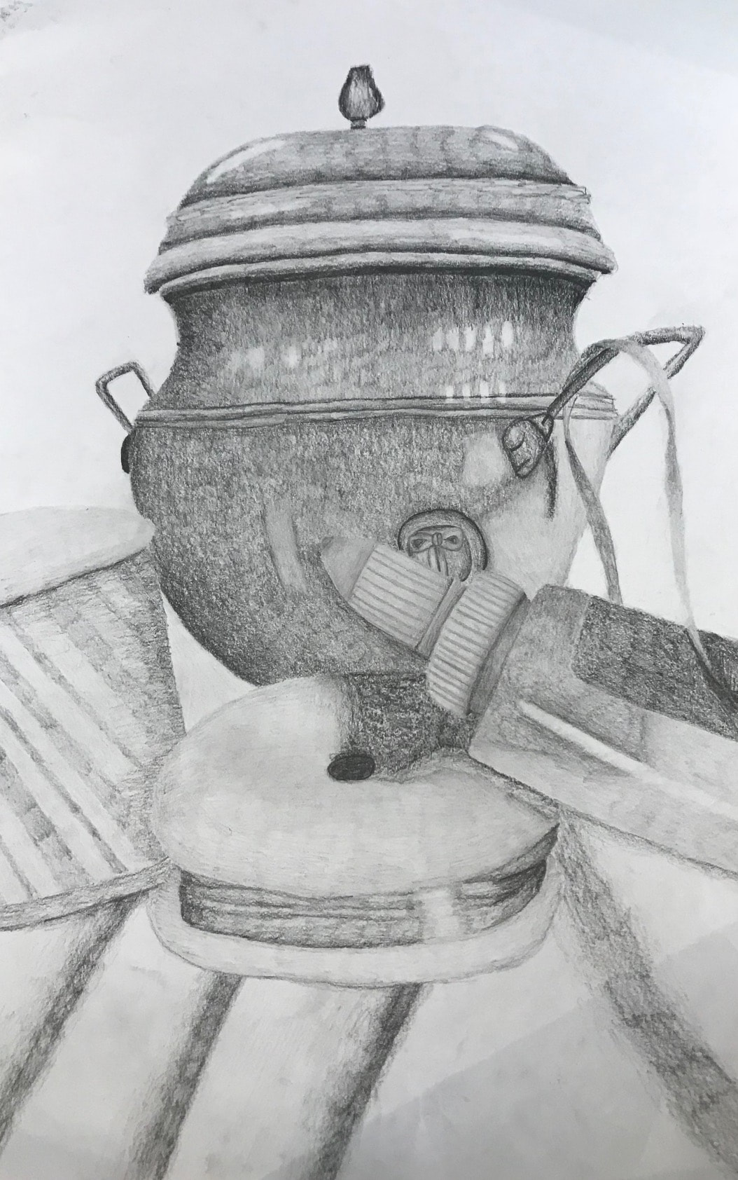
I wanted to do a perspective that was up close and had some negative space. I usually like drawing compositions closer up to have plenty of space to really focus on the lights and the darks of the object. I wanted the little pot to be my centerpiece since it was really cool looking and had a lot of different values. I made sure to use all the pencils, since last time I did a still life I had a very light hand and didn't really move past 2B. Using the whole range opened up the piece more. 2. Are your values and shadows realistic? How many values did you include? How and why are values important? I feel like my values are pretty realistic. Still life is not my strength, so I made sure to push the darks and the lights more than i normally would. I used the whole range of values that the pencils gave me, from lightly using the 2H to being dark and heavy with the 8H. These values are important because it makes whatever you are drawing look realistic and 3D. Without values the objects look like a doodle or an outline for a cartoon. 3. Is there a clear source of lighting? The lighting was hard because there were many different lights coming at different angles, which created interesting shadow. In my perspective, the lights in the backside of the room were right on my objects. You can see the multiple highlights in the pot from each of the lights. 4. How important were the compositional sketches? The compositional sketches were really important because it allowed me to try different perspectives and objects in my composition. It also allows me to see which ones work and which don't, instead of going into my final and then deciding in the middle of working on it that I don't like how the objects are arranged in the composition. Doing multiple was very helpful since there were so many objects on the table and so many perspectives to choose from. 5. How is your final drawing successful? My final drawing was successful because of my composition and value changes. For my composition, I liked how the perspective is very up close to really focus on a few objects than having a bunch and it being to crowded. For the value, using all the pencils helped me be successful to create the widest range or values. 6. Are the proportions, structure and perspective of the subject correct? I feel the proportions are correct, I really focused on where each object overlapped the other, and how to blow up the perspective to fit the bigger paper. Of course it isn't perfect, but it looks correct compared to the photo. The pot was the hardest to get right just due to it's shape and all the details within the pot. 7. Does the placement and grouping of the objects create a pleasing arrangement? Yes, the placement of the actual objects were already set, but finding which objects looked good together was the hard part. I liked the objects I choose to do, and the closer up view of them. Picking the pot to be the centerpiece was very pleasing to me, because of all the values it had and it had a darker tone than the other objects. 8. Is there a center of interest and is it well located? The center of interest is the pot, as previously talked about. I feel it is well located because it's not dead center, it's a little bit raised, and all the other objects are in front of it, so it stands tall and proud in the back. It was a good pick because it had such a nice shape and the top piece was very interesting. 9. How well did you manage your time and resources throughout the process of creating this drawing? Do you see where you could improve in this area? For this project, I managed my time very nicely and worked faster than the previous still life I did. I am usually a slow worker, but was surprised to find myself done with a few days left. This is a nice change, than being a few days behind. I'm sure for the next project which is Prismacolor, I will be having a time management problem. That is one of my slowest mediums. 10. What challenges did you encounter during this project and how did you overcome them? Some challenges I encountered during this project was using the whole range of pencils. I tend to have a very light hand with still life, so it was hard to really push the darks in the piece. I can even go back and push the darks even more. Mapping out the darks and the lights first before fully shading the object really helped to use the whole range and blend them together so there wasn't a line of dark and then a line of light. 11. What have you learned drawing a still life? This time doing a still life, I used to be a little bit more heavy handed. I also learned how to look at an object and see the darks and the lights without using color. It's easier for me to draw the object with color, but breaking it down into just the darks and lights without really thinking about color was hard for me. In the future I will have to do more still life since it's not something that comes easy to me. 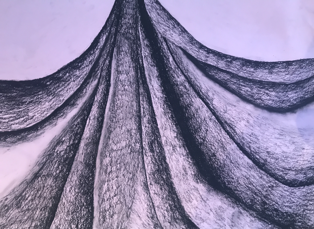 1. Did you use a wide range of values? Explain how this is evident.
I think I used a wide range of values in the project even though with charcoal its easy to get stuck in the middle tones. I had dark parts and other parts that are complete white (or pink in this case). It was challeging since I had never worked with charcoal till our frabric practice. 2. Explain how your knowledge and creating practice studies with values contributed to your piece. With the practice pieces, they were great for well, practice. I had only drawn fabric like one other time, and didn't know the right way to draw it. In the practice studies I got to see what worked and what didn't when drawing fabric. I also got to the think about it both ways with a black and white medium. I felt more comfortable when it came to the final than if I had just jumped in without any previous knowledge. 3. Describe the blending and transitions in your fabric. With fabric there is usually a dark side that transitions to a light side. I started each part of the fabric with the darkest I could go then blended it to light by lighting my weight on the pencil. Some parts were left completly pink for the major highlights in the fabric. I tried to blend out all of the major lines, so there wasn't a line between the transition between dark to medium values. It was very hard to go very light with the charcoal, so the lighter values took more concentration. 4. Explain how your interpretation of texture is essential in capturing the look of the object. By looking at the texture in the folds of the fabric, it allows me to draw a more realistic image. Adding all the textures of the fabric made it really come together and not look like a paper with a few fold lines in it. The texture captues the essence of the fabric and how each part is shaped differently. 5. If you could recreate your piece what would you do differently to enhance the final outcome? I would defintly try the different charcoal pencils instead of just using the 6B to push the values even farther. I would also try to encorperate more blending since with charcoal you can blend with your finger. I could also try to draw more of the fabric, like more towards the bottom of the fabric. 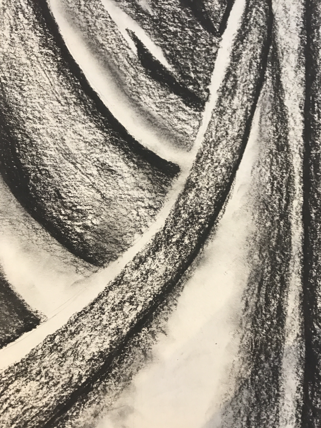 Fabric practice with the black charcoal pencil. 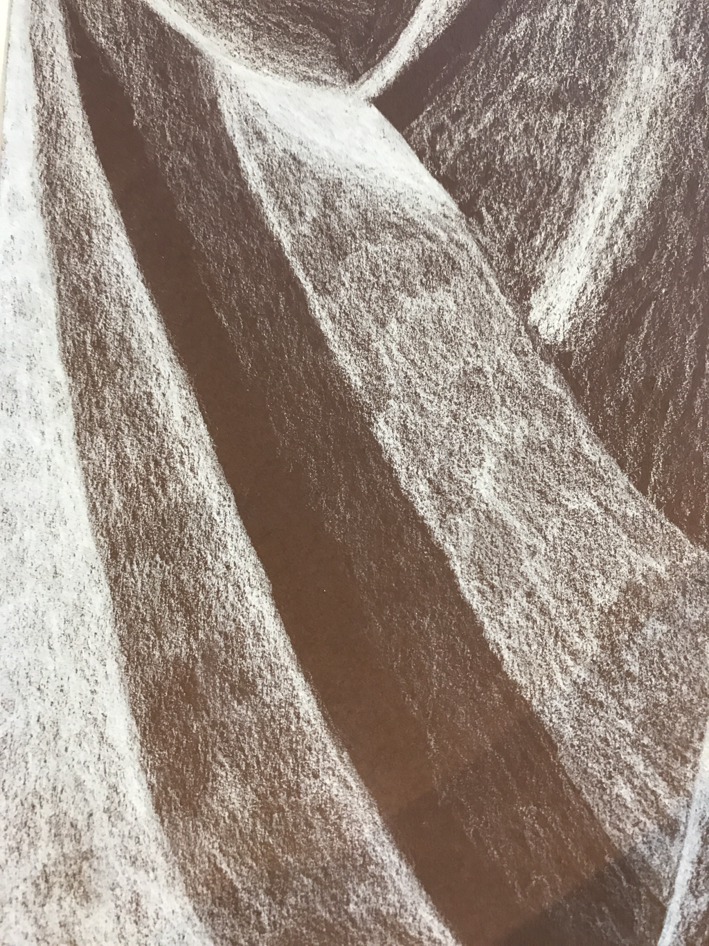 Fabric practice with the white charcoal pencil. 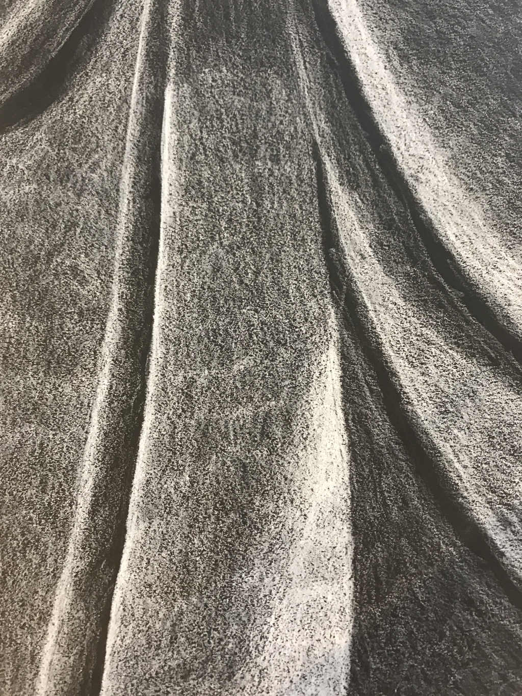 Fabric practice with white prismacolor. For this practice we had to draw three different areas of the fabric with three different mediums. I choose the white charcoal pencil instead of the charcoal chalk because I hate the charcoal chalk. This was good practice in looking at the values in fabric and using different mediums.
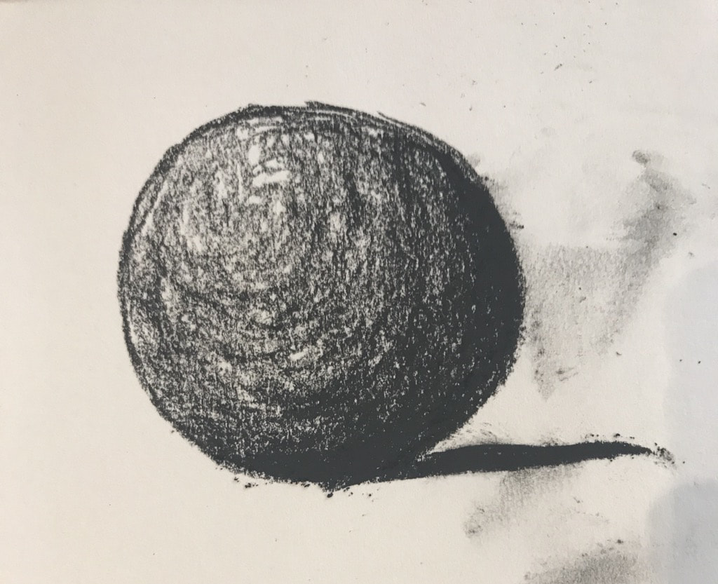 Sphere using the black charcoal pencil. 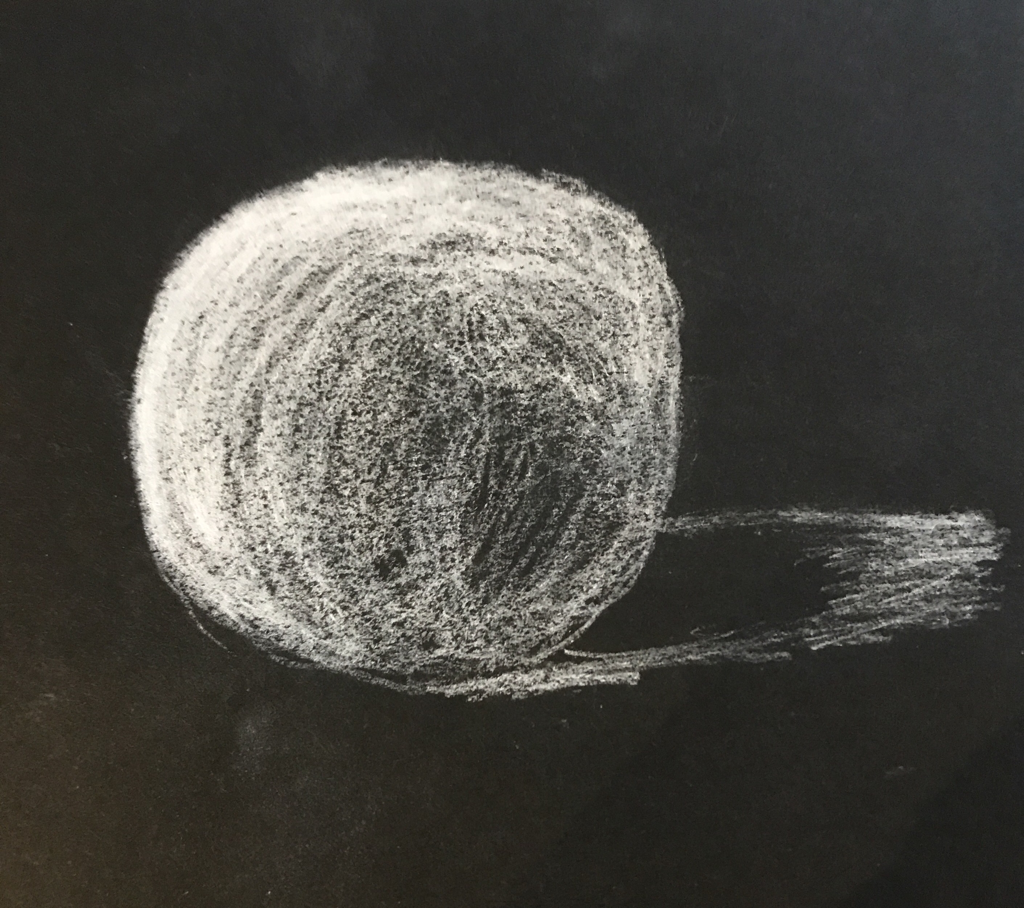 Sphere using the white charcoal stick. I had never really worked with charcoal before so this excersise was interesting. I loved the black charcoal pencil but hated the way the white charcoal stick felt and went on the paper.
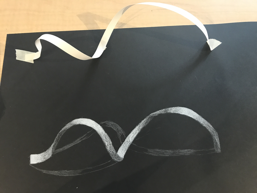 Drawing with ribbon I was looking off of. We had to draw a ribbon using the white prismacolor paying attention to the lights and the dark in the curves and bends in the ribbon. It was a challenge.
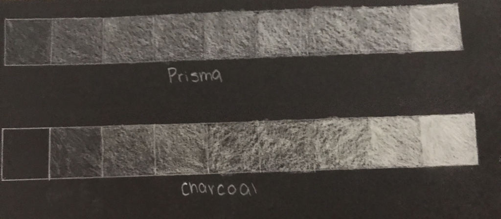 Value charts using white prisma and a white charcoal. 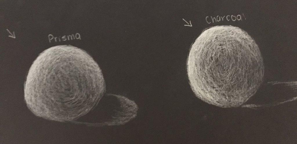 Spheres to practice the shading using both white mediums. For this intro we used white and thought the opposite when shading in forms, that the most pressure of your color is in the brightest areas. It was a different way of thinking and it was challenging.
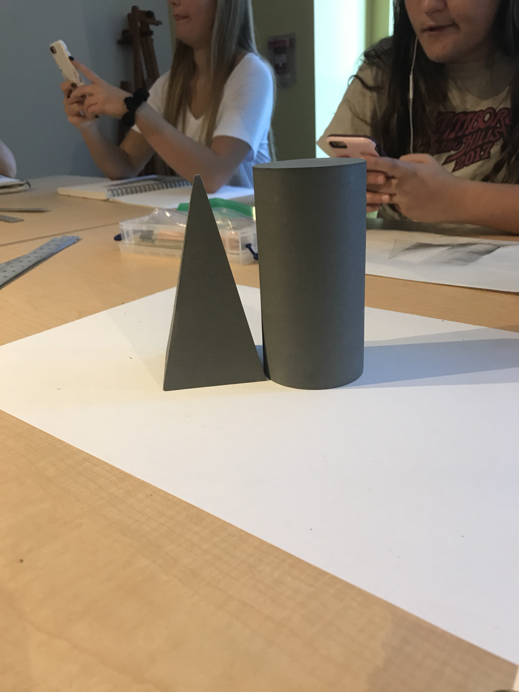 The forms that I was drawing from. 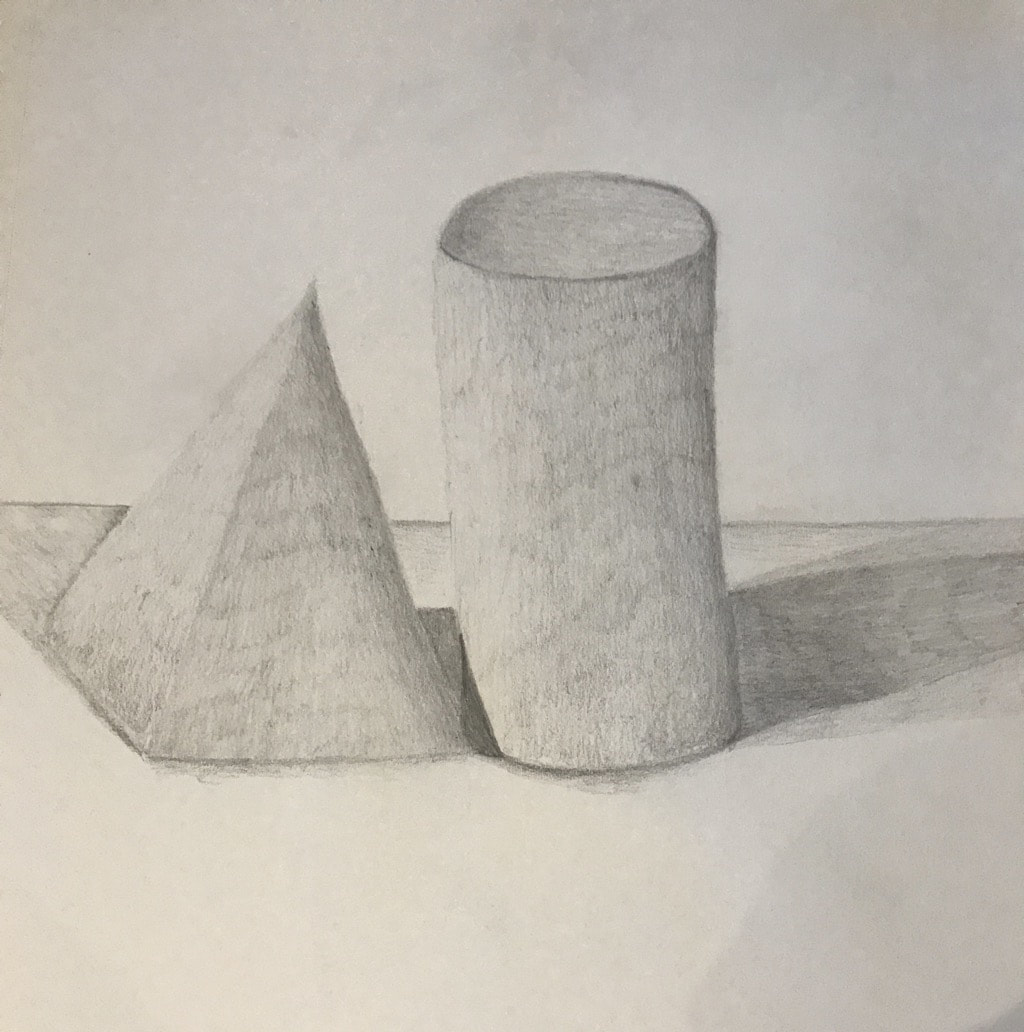 Final shaded drawing. We put two forms in the middle of our table and overlapped them in some way to draw, focusing on shadows and where the lights hit.
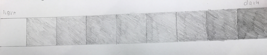 Value chart using a HB pencil. 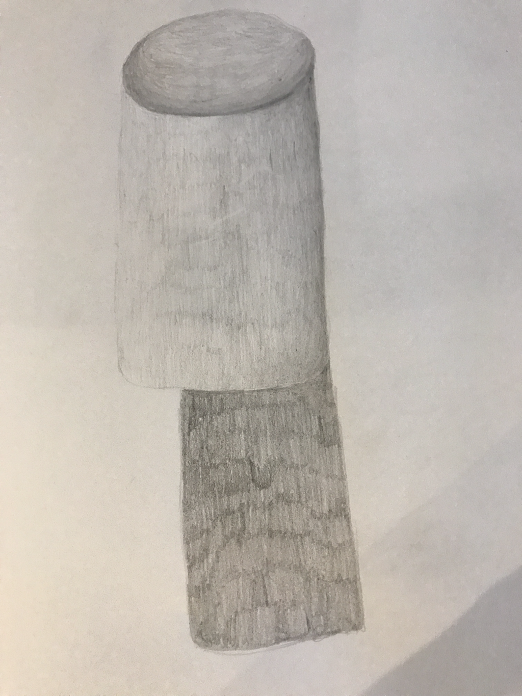 Practice drawing and shading in a cylinder. |
AuthorWrite something about yourself. No need to be fancy, just an overview. Archives
January 2018
Categories |
 RSS Feed
