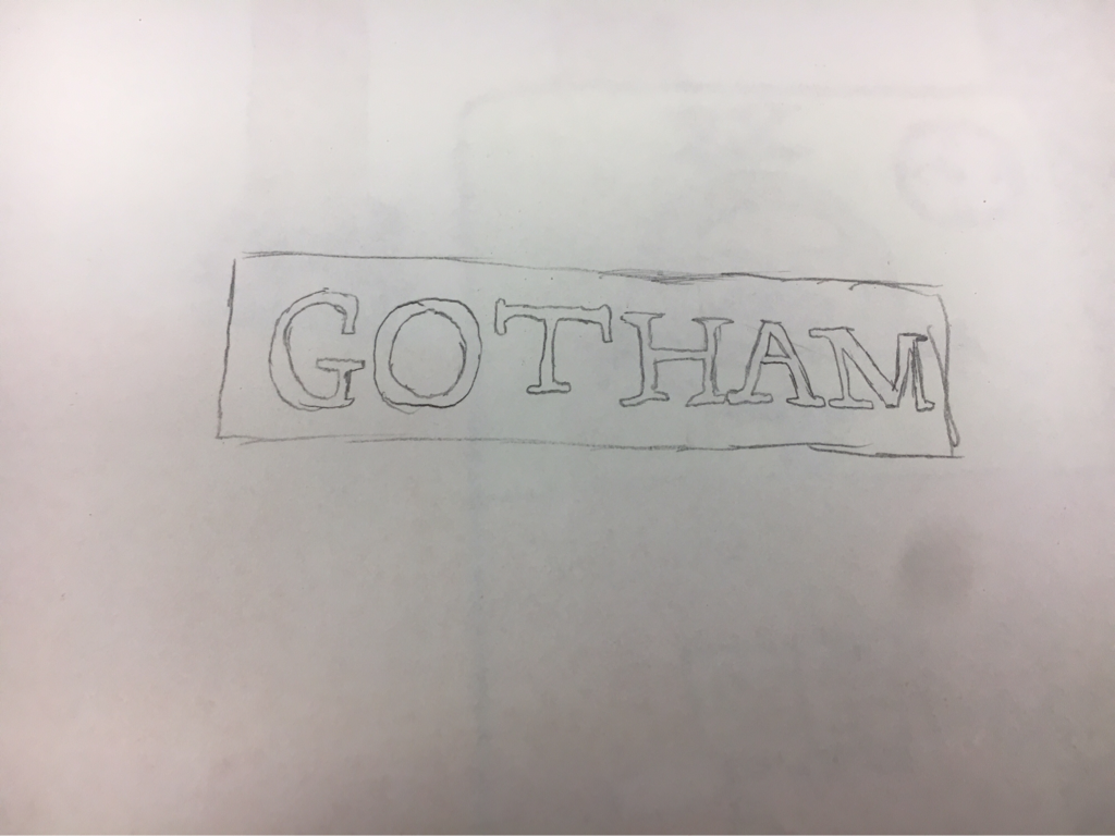
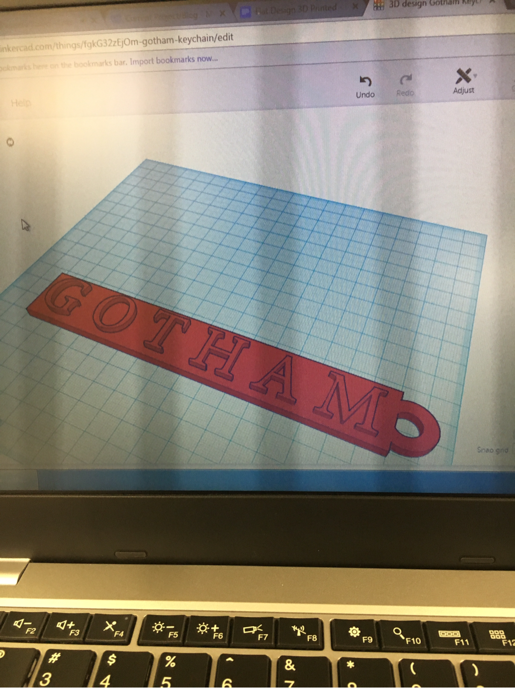
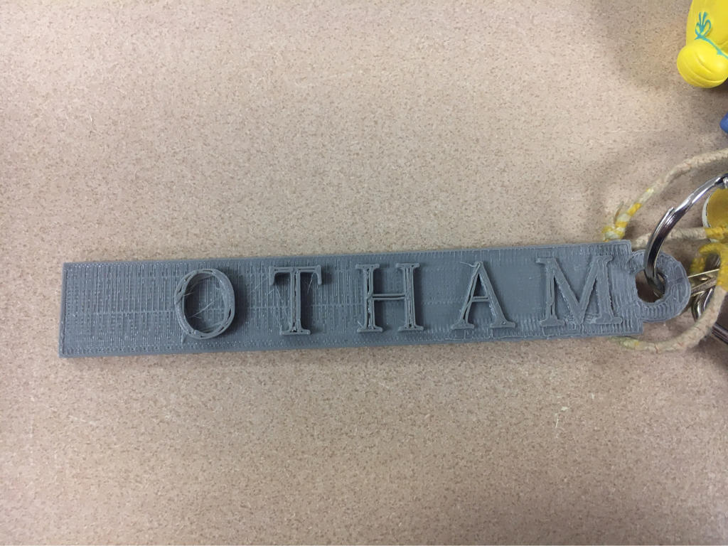
   1. What I found most difficult was trying to get the Gotham Photoshop document into Tinkercad. We eventually figured it out that it had to go through the 3D process on photoshop. Also the G popped off the keychain, but I'm planning to superglue it back on.
2. What I found most successful was that I was actually able to get it printed before it got clogged, and it turned out very well. 3. Gotham is my favorite show so I wanted to do thw logo as a keychain on my keys since I need more Gotham stuff. 1. Title: Kubo and the Two Strings
2. Production Company: Laika 3. The stop motion was completed mainly by using a 3D printer and wiring. 4. The main person working on the stop motion was Travis Knight, who has been with Laika since 2005 when the group was founded. He is now the President and CEO of the company. 5. Something special about the movie is it is the first to use 3D printing. 6. What draws me to the movie is the style and that is looks so much different than other cartoon movies and I know they had put so much effort into actually creating the real life faces and creatures in the movie. 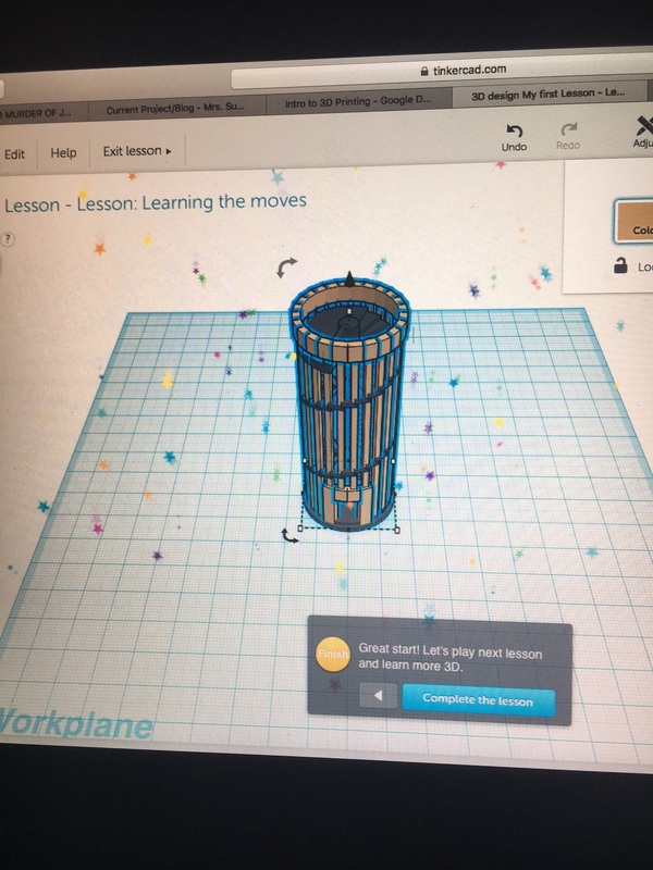  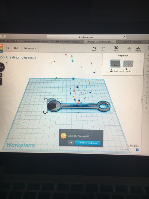   1. What I found the most difficult about the process was moving the workspace to different area like in the dice lesson.
2. I wasn't able to overcome some difficulties because I tried the dice three times and made different mistakes along the way, but you said it was an extra thing, and as long as I attempted it since we aren't going to be using that with our project. 3. Everything else I found pretty easy, like making shapes and sizing them and working with different angles. 4. I feel like the key chain is pretty cool but I'm sure there is so much stuff you can do with a 3D printer that I don't even know about that would be awesome.  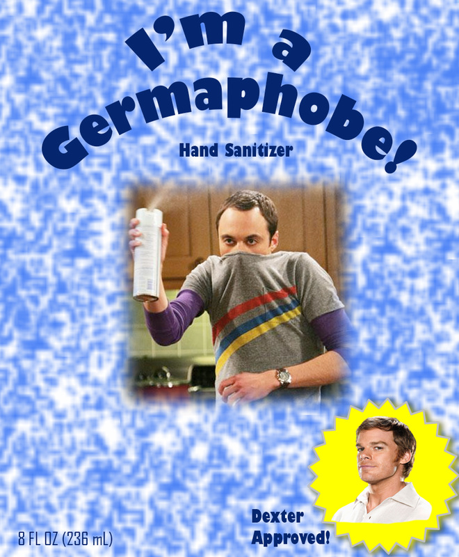 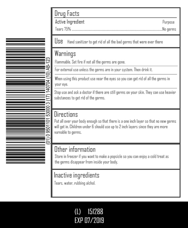 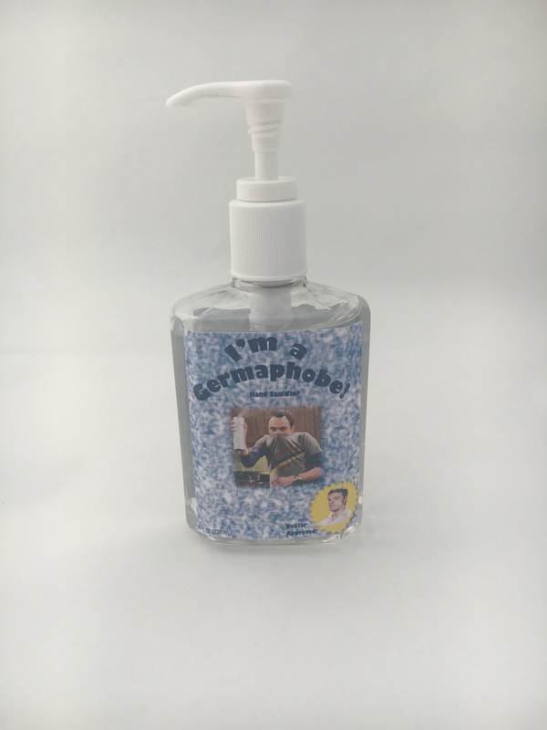 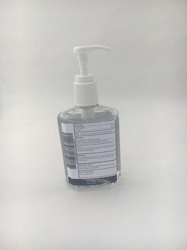 1. I picked hand sanitizer because I am a germaphobe and always have to have a small thing of hand sanitizer with me.
2 .I designed my piece my creating a sort of splatter background, then looked up "germaphobe" on google and the picture with Sheldon was the first thing that popped up and I thought the image was perfect. I then proceeded to put Dexter's face on a starburst because of course my hand sanitizer has to be approved by someone who can hide and clean his own crime scene. 3. I think the back is most successful about my project because I didn't think it would turn out that well and I made the templates and typed everything in for the back as well. 4. If I could change anything about this piece I would make my sizing a tad bit smaller, but I wanted to be to big and be able to trim it than it be to small. 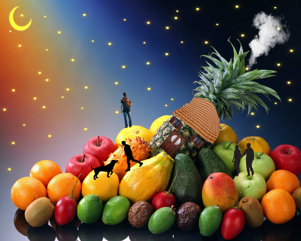 1.No one particularly lives in the house, I wanted to make it more of a community around the house. The one part I particularly picked is the dude standing at the top because that was my original idea when I saw the picture.
2.To make it realistic I had to warp the roof design I had to fit around the pineapple, and have the door match the windows as well. 3.If I could change anything, I would try to find better pictures to layer because it was hard trying to find a good picture that didn't have a watermark. 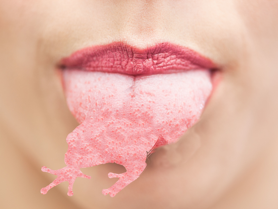 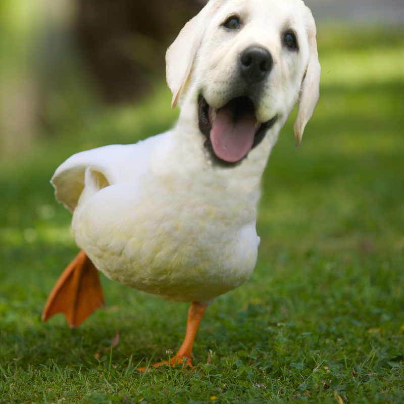 1.I had a lot of problems during this project. I have learned throughout this class that I am not the greatest at photoshop but hey that's why I'm in this class. Dividing between the layers is my biggest problem in general. For the frog tongue I accidentally made it all one layer, but was still able to use the clone tool to even out the colors.
2.If i could change something about this piece it would be to blend out a little more and to use a picture of my own dog as the head, as originally planned, but the lighting didn't work out as well. 3.My animal is a dug which is a mix between a duck and dog. I knew I wanted to do a yellow lab since they are my favorite animal, and labs are usually known for hunting ducks and the coloring is similar. Plus I looked up dog birds and they were pretty hilarious. |
Archives
December 2016
Categories |
 RSS Feed
