I had made this whole blog post when I had finished the piece, but Weebly decided to delete it, so I do not have in progress pictures since I deleted them since I was done with the post. So here we go round two.
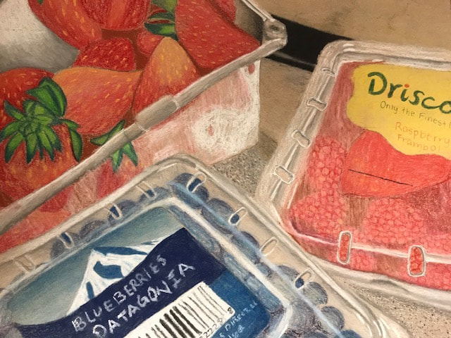
1. I think that my piece is well executed because the lines are clean and everything in the piece is well organized. The piece is neat in the fact that all the shades are blended and nothing looks rushed.
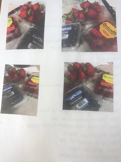
2. My choice of colors really were based of my reference picture, I didn't change any of the colors. But when I was taking the picture I made sure to have different colored fruit, like the red in the raspberries, the green in the leaves, and the blue of the blueberries.
3. I created contrast in my drawing by using different textures in the fruit and the countertop. I also created contrast by putting bright highlights against darks. Also by overlapping objects and having a foreground and background, helps creates contrast.
4. I used different textures like the pattern in the countertop, to balance out the smoothness in the plastic that the fruits are in. Plus the different textures in the fruit, like how the raspberry has little bumps and the strawberry has the seeds, really defines and help separate the fruit, so each kind is defined and it doesn't just look like random red fruit. Also adding the darks and lights in the plastic creates depth and can tell where the plastic is rounded, or where there are holes on the top where the fruit is showing more through.
5. Understanding the media is a very important aspect, by practicing with the candy project, I got a good understanding of how to work with pastel and how to draw opacity, so by the time I got to my final I was more comfortable and was able to push myself more. I would have been at a disadvantage if I had gone into this project without that knowledge.
 RSS Feed
