|
My third concentration piece was based on the song Man in Black by Johnny Cash. The song is him talking about how until there is no poverty, war, etc. he will continue to wear black. The basis behind the piece was that one half would be representative of the rich and fortunate with everything being in color, and then the other half with symbols of war and poverty, and everything on that half is black and white. On the colored side there is the silhouette of Cash like on the album cover, and on the other side there is one of the lyrics, "till things are brighter".
This semester in Art 4 had been an experience. When I went into this class, I had gone from Art 2, and I wanted to skip Art 3 because I really like the style of Mrs. Rossi's class and wanted to have her again. On the first day I walked in and knew a few people, and recognized others, but didn't really know a lot of people that I could just go up and talk to. Throughout the first week, I felt very intimidated, because everyone was very good at art, and it was a different dynamic than Art 2. I felt inferior to a lot of people, and felt more self conscious about my work. Looking back on that first week, a lot has changed. Now I am familiar with a lot of more people in the class and are very close with the people at my table. I am no longer self conscious about my art and am more open to opinions from my peers because I know I will gain good trusted opinions. Some things I wished I was prepared for in this class was just mediums I had never worked with, like oil paint or mixed media. A big thing that I learned in this class is time management. I learned which mediums I work faster in, and if there was a medium I was slower in I would work smaller. I do work at a slower pace which I learned last year, but this semester really proved to be my downfall. This was the first art class I had to work a lot at home. Next semester I am looking forward to being with the same people in the same environment, and working on pieces I enjoy.
The song for my second concentration piece is Father's Son by 3 Doors Down. The song is about a man who comes to a bar and picks up a young prostitute, then years later come back to the same bar and he now was a family and a daughter. As he's at the bar he thinks back to the time before and thinks about if his daughter had ended up like the other girl and starts regretting what he did. So for this piece I decided to do a bar scene where it was a unclose of a beer bottle with the label including a lyric from the song "what if that was my little girl" and a silhouette of a daughter figure to symbolize the guys regret in the bar. Also I included a crumpled up 100 dollar bill to signify prostitution. To create an interesting composition along with those things, I added different colored lights in the background to reflect off the beer bottle.
For my concentration, I wanted to do something that I would enjoy doing, so I thought about what I love and I love music. So this piece was the first idea I came up with when thinking of concentrations. The song behind this piece is Strawberry Fields Forever by The Beatles. The song is based off this orphanage Strawberry Field that young John Lennon had by his house. He described the outside as being dark and rustic, but once you step inside it was filled with flowers and almost seemed enchanted. I connected that concept to his childhood, where his dad left him at an early age and remarried, and his mother gave him up to his aunt and uncle, because she felt she was not fit to mother him. His mother also met an untimely death when he was 16. This part of his background was the imagery I used towards the bottom of the piece. Then towards the top I used the flowers he described coming out and around the fence. Over top of it is part of the red fence that belonged to the orphanage. This piece was my first experience in mixed media. I have always wanted to do one because the mixed medias pieces I've seen. Overall, I think the piece turned out pretty good, it was fun to see how the piece evolved as I went through and added aspects that weren't originally planned. If I were to do this piece again I would add more layers and put the gel medium between each layer. I would definitely do another mixed media piece in the future as it was very fun to do. I think this piece was a good start for this concentration.
My idea for this piece was mechanical bunnies on a stone pathway with bushes around it and the main bunny up front next to a flower coming out of the side. This piece was one of the harder ones to do this semester because it was my first time combining multiple pictures for a composition. Usually I just have a reference photo to go off of. The part that was the hardest was the metal. Metal has so many highlights and darks that when I usually do metal, I have one reference photo and I break the metal into different chunks and focus on the shapes of the different shades. So without a solid reference photo, it was hard to know where all the highlights and darks were supposed to go in order to make the metal look realistic. But these challenges have helped me grow as an artist and focus more on established a light source or multiple and how that effects the shades and highlights on the objects.
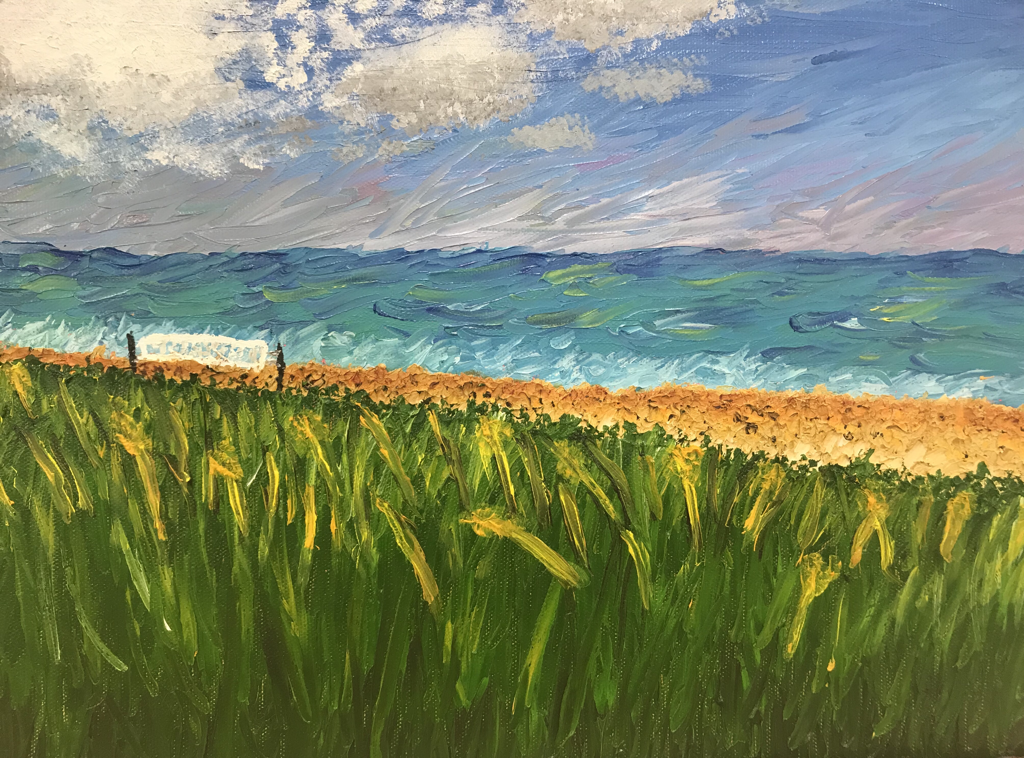 Final In my first attempt at palette knife, I said I would never do a piece in it unless I had a change of heart, which I guess I did. The reason I choose to do palette knife was because the way the picture was set up with the grass and everything, I felt like it would be a good one to do in palette knife. Plus we were in a rush to get this piece done, so I thought it would be faster, which it was. I had free time in drawing, my next period, so I got most of it done in the two days using both of my art periods. The reason why I picked this lanscape was because I wanted it to be a place that means something to me, instead of painting something I have no connection to. This was taken at the beach of the hotel Atlantis Lodge, where my family has gone every year with our dog since I was born. Some thing that I liked about this piece is all the pops of color I could blend with the palette knife, like pink into the sky or bright green into the sea. Some things that I had trouble with was not overblending a color so you couldn’t see it. I also had trouble doing some details like the volleyball net since the texture in the sand was so rough. Overall I’m happy with how the piece turned out and how the colors look together. This might inspire me to do another palette knife painting in the future.
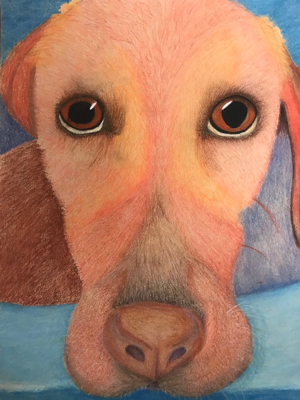 Final I was really looking forward to this project because I've wanted an excuse to draw my dog, and I just haven't had time to do it at home. I choose the photo because it was up close of her, and since she was wet, you could see the details in her fur. The only thing I don't like about the photo is that she's making a miserable face because it was after a bath and she hates them. I used the medium chalk pastel pencils because we had just used them in drawing and I learned I work fast with them, and we have a lot of projects to do this semester, so my hope was to finish this project on time, which I did. Choosing warm colors to do her face was a good choice because I was able to add more of a variety of colors instead of just her normal fur color, which was a lot of bland yellow. To balance out the warm colors I made the background using cool colors. Some issues I had was getting all the different colors in the fur. In the picture there are different colors integrated within each part of fur. Another thing I had trouble with was blending different colored section together, like the more darker or redder section together with the lighter or more orange section. Overall I think it came out well, but I could always go back and fix it, along with any project I do. It was a fun subject and medium to work in, and I would love to draw my dog in colored pencils if I had the time.
This project was hard for me because it was my first realy piece in oil paint, and my first portrait. For something that was different than just a regular portrait, I did different makeup and more of a shocked expresssion. To start this project I grided it out since I had never done portraits before and that really helped with the position of the eyes, nose, and mouth. Some problems I had while doing this was the nose because most of it is shading and not standard lines. Another problem I had was being to thin in my layers while painting. What I found good about this piece was that it was very easy to blend out the values, and the teeth that were showing actually turned out looking like teeth. Overall I think this piece came out well, but I would like to do another portrait again, now knowing what I learned in drawing about where everything is placed and how to properly shade it.
|
AuthorWrite something about yourself. No need to be fancy, just an overview. Archives
March 2018
Categories |
Projects
 RSS Feed
