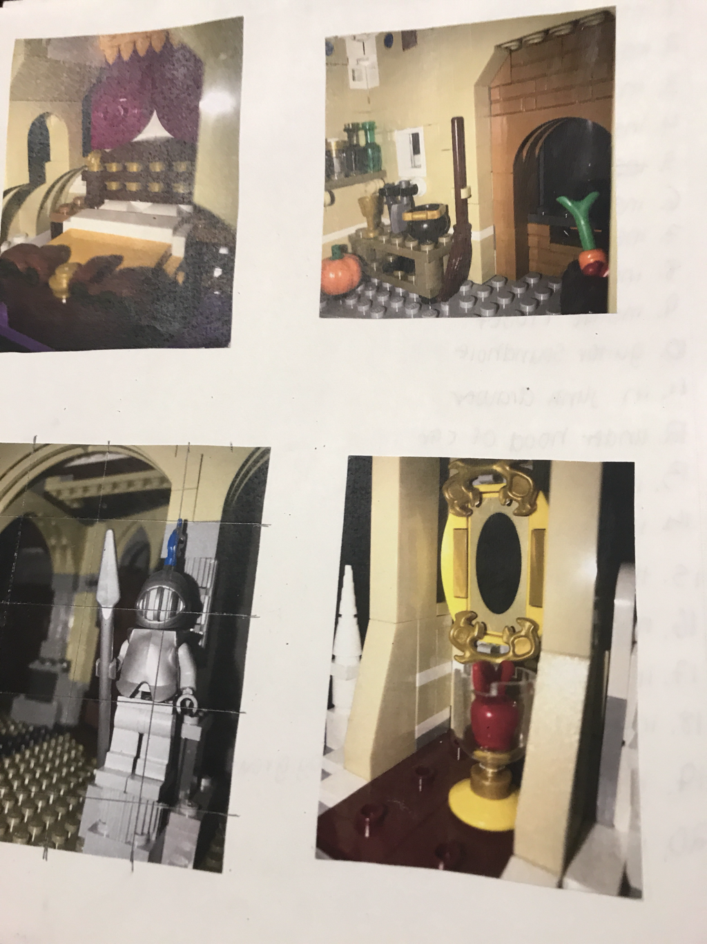
Idea #1- Lego Spaces
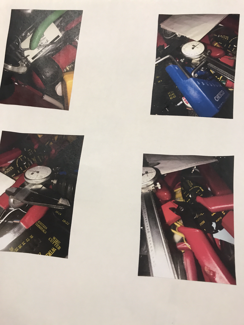
Idea #2- Inside of Toolbox
In Progress
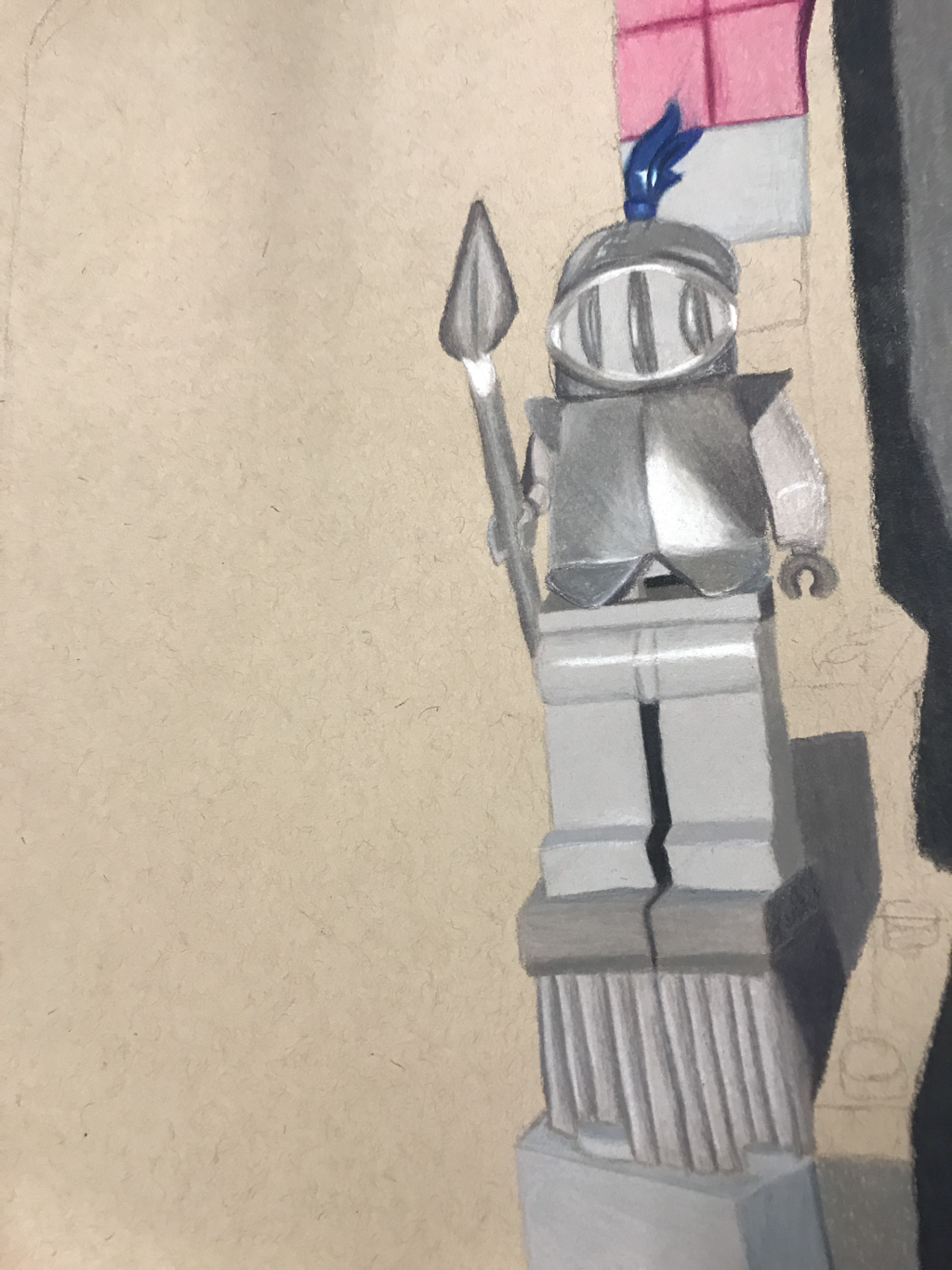
This project was fun to think about. I wasn’t originally thinking of doing the Lego idea until I went around my house thinking about what could work. Last Christmas I built the Magic Kingdom with Legos, and the back of the castle has little different rooms that’s supposed to represnt a different Disney movie. The knight one looked the best with the knight being upfront. I didn’t want to do the yellowish color in most of the background, so I changed it to pink and the brown Legos to purple, colors that look good with gray and remind of a magical castle. This project was very time consuming, and as of writing this post, is not finished. All the individual sides of each of the pieces took up the most time. Getting different values and seperating between the midtones and the lights and the darks was the hardest part. Since I am not finished, I can’t comment on how the piece looks fully yet, but so far the knight looks pretty good and the bright blue of the feather looks pretty cool. I love Legos, so doing Legos for the object is really fun for me to think about. Everything is very perportional, and if something is off, it stands out. I look forward to finishing this piece.


 RSS Feed
